Twitter simplifies its bird logo
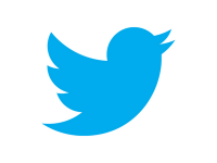
SAN FRANCISCO, June 6 (Xinhua) — Micro-blogging website Twitter on Wednesday announced it will simplify its logo, dropping the text and making the blue bird silhouette more simple and happy- looking.
According to a video posted on Twitter’s blog, the new logo was created from three sets of overlapping circles. Compared to its predecessor, the blue bird got a haircut, lacking hair atop its head; and the wing looks sharper and drops one feather to three from the original four.
The new bird also got an upturned beak, making it look like a happy bird which is ready to take off. Meanwhile, the new bird is also in a darker shade of blue than the old one.
“This bird is crafted purely from three sets of overlapping circles — similar to how your networks, interests and ideas connect and intersect with peers and friends. Whether soaring high above the earth to take in a broad view, or flocking with other birds to achieve a common purpose, a bird in flight is the ultimate representation of freedom, hope and limitless possibility, ” said Twitter in its blog.
Bloomberg reported last week that Twitter expects to generate at least 1 billion U.S. dollars in sales in 2014, almost double some analysts’ current prediction.
Market research firm eMarketer expected Twitter to report 259.9 million dollars in sales in 2012 and 540 million dollars in 2014. <Xinhua>
news@theasian.asia


