


The Fine Line Between Advertising and Propaganda Explored Through Hong Seong-hye Artwork
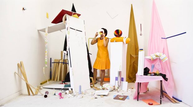
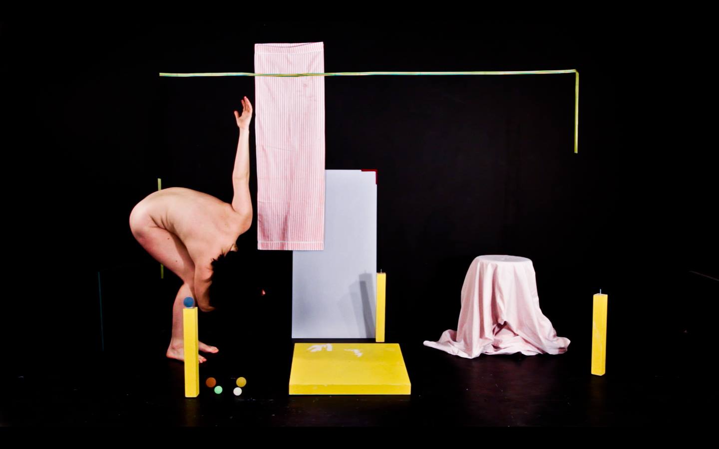
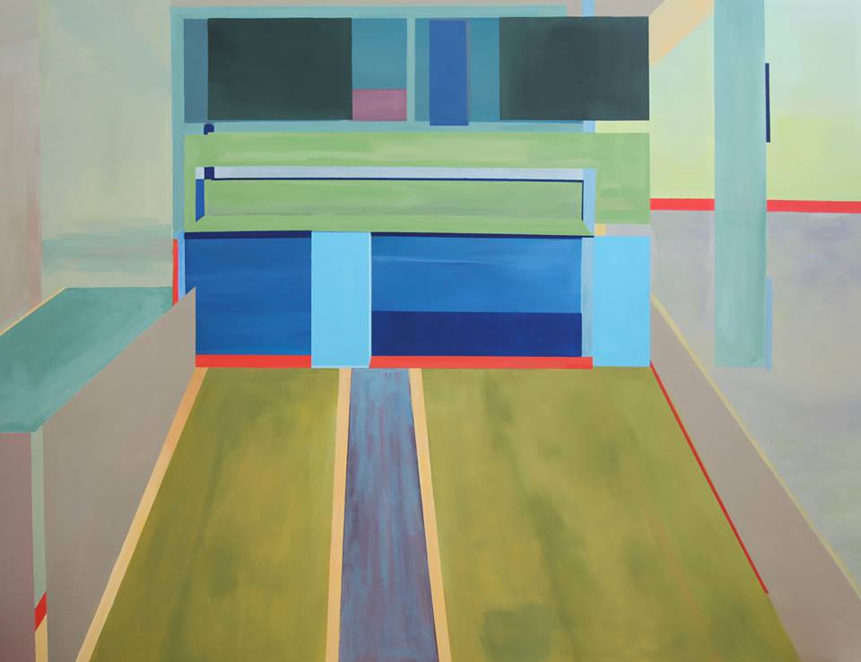
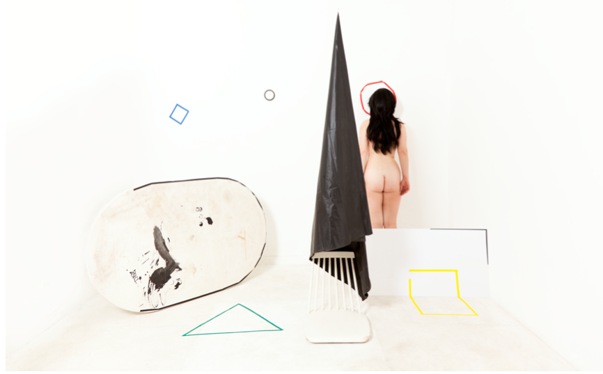
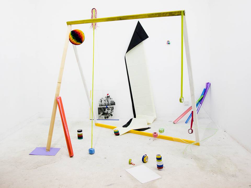
Hong Seong-hye artwork (Photo by Hong Seong-hye)
The first time I heard about the concept behind Hong Seong-hye paintings, I thought it was very interesting in its complexity. By analyzing propaganda art used during wars and for advertising, she created her own way of expressing her unique artistic intention.
Born and raised in South Korea, Hong is a young artist who studied in France. The time she spent in Europe influenced much of her artwork that is soaked with symbolic meaning. During our interview, she explained to me her idea of propaganda, the psychology of colors, the structure behind commercials, and the relationship between art and corporations. She will hold a solo exhibition in Seoul (Alternative Space Loop) from August 11th to September 3rd.
Can you explain the meaning of your current project?
To begin with, my project explores first the misconception of images. I started studying commercial images based on American advertisements created between 1910 and 1980. I saw postcards of those advertisements as a young child and I felt an emotional connection to them even though I had never been in that environment; even when all the people in the postcard were Western and I grew up in Asia. It was shocking when I realized that those images were part of my childhood even though I never experienced anything similar to it.
Then, I searched other commercial photos of the same period and saw that they had similarities. I remembered studying Edward Bernays (Austrian-American publicist) and discovering the link between war propaganda images and commercials. Having seen how effective propaganda was during the war, Bernays wondered whether the same effect might prove equally useful during peacetime.
In one of his books, Propaganda, Bernays hypothesized that by understanding the group mind, it would be possible to manipulate people’s behavior without their even realizing it.
War propaganda was very violent and direct in creating monsters out of the enemies, and I think that the commercial images of the 1910s-80s convey the same violent message and invoke the parallel psychological reactions from its audience.
War propaganda images and commercial images are closer to each other than people think. The latter taught people the kind of furniture or the type of house they should buy. Moreover, they communicated and represented the lifestyle that they (image producers) believed people should want. For all these reasons, I feel there is a violent message hidden in both commercial and war images because they communicate a specific message to the audience. That is why I refer to advertisements as “propaganda images”.
Are commercial images the same as those used in the past?
Today, images are different, but the desire of achieving whatever is inside the images is still present. The target audience has also changed: the advertisements are not limited to the white family unite with a working father, housewife mother, and children. The specific role of people in the family may have changed, for example, more women are working out of the home. But there are also new types of buyers such as gay couples and/or single people. That is why many advertisements (especially in Europe) feature gay couples as the main characters.
Let’s return to your artworks, can you describe them?
I started thinking about this current project in 2010. I used to form images through different media such as painting, photography, video, and drawing. These are mediums though which I express my artwork. For me, the concept behind my artwork has always been more important than the means used to create it.
I personally think that the paintings are the most interesting part of your artwork and also the most complex to understand. Can you describe them?
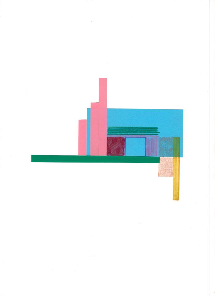
My paintings are based on the combination of two elements: structure and colors.
The way in which commercial images (1910s-80s) divided the space of the advertisement was way more experimental than images we see nowadays on Instagram or in contemporary commercials. So, I used the structure of those commercials and moved it to my paintings adding a specific combination of colors to create my work.
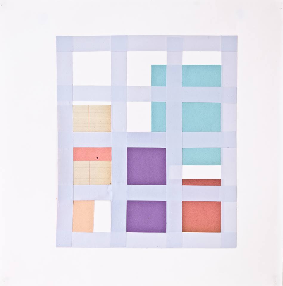
Color is another important aspect of my artwork. In fact, I noticed similarities between colors in the Western postcards of the same period (1910s-80s). The colors and the structure were strikingly alike. I became really interested in this and began researching to find Eva Heller, a German sociologist, who analyzed how German people emotionally react to certain colors.
Those who were interviewed by Eva Heller for her study on colors were born in the 1910 to 80s, so they had been directly influenced by those advertisements I mentioned earlier.
This means that that generation of people was educated to connect certain emotions to specific colors. Heller came up with 13 colors that cannot be excluded when it comes to studying the psychological connection to colors. For instance, survey participants associated blue, white, and gray with the emotion: coldness, so Heller placed these colors together into a single palette and called it “coldness”.
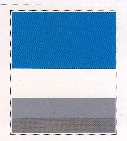
“Coldness” (Eva heller_Colour psychology)
In this way, while Heller was interested in people’s reaction to each color as a single unit (placed together as palettes), personally, I am not interested in colors by themselves. I choose to work with the palettes Heller formed but mixing the individual colors of each palette. For example, I mix the colors of “coldness” to produce a new color for my artwork.
The new mixtures that I make, I refer to as codes—color combination codes. These codes represent a new message. The result of the combinations to me is more interesting than working just with the colors.
After Andy Warhol turned the Campbell’s soup can into art, many artists used other commercial products to create art. What is the relationship between art and advertising in this decade? What is your personal idea of advertising art?
I do not find commercial items significant in creating my artwork. I would not use them because my idea is to analyze all the single aspects of the advertisement, not to use it in the art. But if any artist said they had created “art” out of such product, I would consider their work as art. Just because a company provides you with a medium to work with, it does not mean what you have made is not art anymore.
The Italian artist Depero, famous for the Campari soft-drink promotional campaigns, provocatively declared that “All arts in the past centuries expressed an advertising objective. In those times, art was at the service of churches and states. Today it is the corporate world and its captains who commission artworks.” What do you think about this sentence?
Being an artist is also a career; a job. Having a company that supports artists seems like it could limit artists but it is just a way to stay in this field and continue expressing artistic ideas. Of course, it is not good if an artist is limited, but being connected to corporates is not necessarily a bad process. I think that an artist can never totally free because he/she can be limited in so many ways such as by other social conditions and one’s inner thoughts. We cannot exclude all these factors that influence any artist.
Which people inspired you for this project?
People who inspired me for this project are Norman Rockwell, Edward Bernays, Pierre Bourdieu, Eva Heller, and modernist artists in general.
-
- Hong Seong-hye
-
- Hong Seong-hye
-
- Hong Seong-hye
-
- Hong Seong-hye
-
- Hong Seong-hye
-
- Hong Seong-hye
By Alessandra Bonanomi, reporter for The AsiaN